Mojo Concerts
Info
MOJO NL is a division of MOJO Concerts, representing one of the largest and most diverse rosters of Dutch artists, with around 150 unique acts. As part of the leading organisation within the Dutch live music and festival industry, MOJO NL plays a central role in the promotion of concerts and artists nationwide. We were asked to develop a bespoke motion branding system for MOJO NL in the form of animated typography.
Scope
The visual identity needed to be applicable across a wide range of communication moments, from concert promotion and artist announcements to ticket sale calls-to-action, timetable updates and status messaging. The animation style had to reflect MOJO’s authority and leadership within festival culture, while remaining neutral enough to leave full space for the individual visual identity of each artist.
Deliverables
Custom animated typography system
Motion branding toolkit for digital promotion
Template-based animations
Brand-aligned motion identity for MOJO NL
loading...
loading...
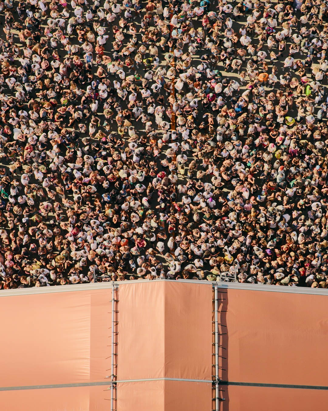
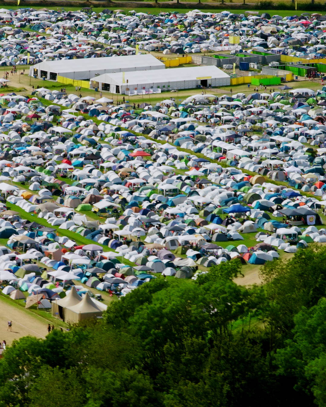
MOJO NL operates at the heart of Dutch festival and concert culture. As a long-standing authority and trendsetter within the industry, its visual communication needs to radiate leadership, experience and trust. At the same time, MOJO is deeply committed to giving artists full freedom to express their own identity, requiring a motion branding system that is powerful, yet never dominant.
This balance of experience and neutrality formed the core of the creative challenge.
The animated typography had to be instantly recognisable as MOJO NL, while functioning as a supportive layer rather than a competing visual signature. The motion branding therefore focuses on clarity in information and flexibility across genres, stages and artist styles. This together with graphic elements and movements that are relatable to the industry they are operating in.
Whether used for a sold-out alert, line-up announcement or show-time update, the motion remains consistent and informative without ever distracting from the artist being promoted.
loading...
loading...
Beyond aesthetics, the system was built as a practical communication tool. The animated type functions as a modular interface that can be deployed rapidly across all platforms. This allows MOJO NL to respond instantly to changes in programming, ticket sales and live updates while maintaining visual consistency at all times.
Great attention was paid to:
typographic rhythm
readability at different scales
timing and flow of animation
graphic balance between motion and still imagery
In close and enjoyable collaboration with the MOJO NL team, we refined the style through continuous testing and alignment. Together, we developed a motion identity that reflects both the energy of live culture and the professional authority of one of the most influential organisations in the Dutch music landscape.
loading...
loading...
video deliverables 16x9